Black-and-white photography removes one of the easiest ways for an image to impress you: color.
That is part of why I like it.
Without color, the photograph has to stand on other things. Light. Shadow. Shape. Distance. Atmosphere. Tone. The image has to hold together without the obvious beauty of a sunset, a blue sky, red rock, green trees, or golden light.
That can make black and white less forgiving. It can also make it stronger.
When a black-and-white landscape works, it does not feel like a color photograph with something missing. It feels like the most direct version of the image.
The question is not, “Would this have been pretty in color?” The question is, “Does the image become clearer without it?”
Light becomes the subject
In black-and-white photography, light does not just reveal the subject. It often becomes the subject.
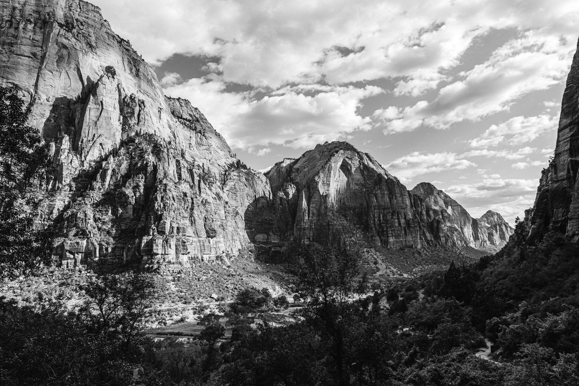
A canyon wall is not only a canyon wall. It is a place where light falls, breaks, disappears, and returns. A mountain is not only a mountain. It is a shape made by light and shadow. A river is not only water. It is a line of movement through tone.
That is why the time of day matters. So does weather. So does waiting.
Hard light can create structure. Soft light can create quiet. Storm light can separate a landscape into layers. Overcast light can let texture come forward. Backlight can turn a familiar place into something graphic.
There is not one kind of “good light.” There is only light that gives the photograph something to work with.
A bright, cloudless day can work if the shapes are strong. A gray day can work if the tones are subtle. A storm can work if it gives the scene depth. A harsh shadow can work if it creates structure.
Black and white makes you pay attention to what the light is doing, not just what the subject is.

Form matters more without color
Color can carry an image even when the composition is weak. Black and white usually cannot.
Once color is removed, the structure of the frame becomes more obvious.
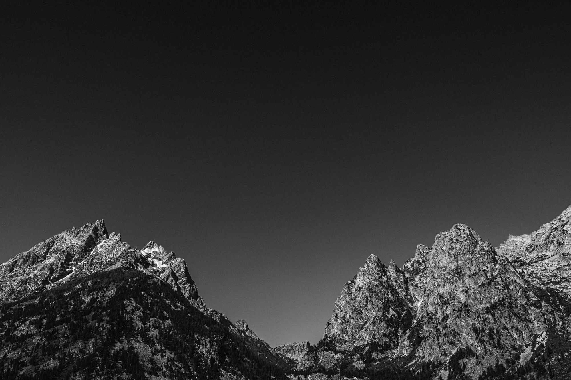
Where does the eye go first? What shape holds the image together? Is there a strong line, mass, opening, or rhythm? Does the foreground help or distract? Does the sky matter? Does the frame have weight?
In a landscape, form can come from many things: cliffs, ridgelines, trees, rivers, snowfields, shadows, roads, clouds, or empty space.
The American West works well in black and white because so much of the land already has strong form. Canyons, deserts, mountains, river bends, and open plains are built from shape and contrast. The photograph does not have to invent structure. It has to notice it.
A good black-and-white landscape photograph usually has a strong underlying structure. Even if the image feels quiet, something is holding it together.
Tone is everything
A black-and-white print is not simply black and white.
It is the space between them.
Deep blacks give the image weight. Clean highlights give it air. Midtones carry the information: rock texture, tree lines, water, cloud movement, snow, dust, distance.
If the print has no deep blacks, it can feel thin. If the highlights are too harsh, it can feel brittle. If the midtones are muddy, the image loses life.
Good black-and-white printing is often about balance. You want the print to have enough contrast to feel alive, but enough subtle tone to keep you looking.
On a screen, black-and-white images can feel more dramatic because the screen glows. A print is different. A print reflects light. It has to work in the real world.
A print with deep blacks and no detail can feel blocked up. A print with too much midtone and no true black can feel weak. A print with blown highlights loses air and subtlety.
The best black-and-white prints have structure and restraint.

Contrast is not the same as quality
People often associate black-and-white photography with high contrast.
High contrast can be beautiful. It can make an image feel graphic, direct, and strong. But contrast alone does not make a print good.
Some photographs need bold contrast. Others need a softer scale of grays. Some images are about deep shadow. Others are about atmosphere.
The right contrast depends on the image.
A canyon wall in harsh light may need deep blacks and sharp separation. A foggy mountain photograph may need restraint. A river scene may need enough midtone detail to keep the water alive.
The print should not be forced into a style. The tones should fit the photograph.
Texture helps the image slow down
Texture is one of the quiet strengths of black-and-white landscape photography.
Rock, water, bark, snow, grass, sand, clouds, and old wood can all become more noticeable without color. The image becomes less about “what color was it?” and more about “what did it feel like to look at?”
Texture can also give the print a physical quality. The surface of the paper interacts with the surface of the landscape. A matte fine-art paper can make the image feel less like a screen and more like an object.
That matters because a print should not feel like a JPEG on paper. It should feel like its own thing.
A good landscape print gives you something to see from far away and something to discover up close. The texture is often what rewards the closer look.

A good black-and-white print has distance
Some photographs work best up close. Others work from across the room.
The best black-and-white landscape prints often do both.
From across the room, the image should have a clear structure. You should be able to feel the main shapes quickly: dark mass, light opening, mountain line, canyon wall, river path.
Up close, the photograph should give you more: texture, small details, tone changes, edges, atmosphere.
That two-level experience is what makes a print last. You see it quickly, then slowly.
This is one of the differences between an image that looks good on a phone and an image that works as a print. A phone image can rely on immediate impact. A print has to stay interesting after that first impact is gone.
Black and white should have a reason
Not every photograph should be black and white.
Some images need color. Color can be the whole point. A desert wall at sunset, a green alpine lake, or a strange blue shadow may lose something important without it.
But some images get stronger when color is removed.
The question is: does black and white make the photograph clearer? Does it make the structure stronger? Does it make the light more important? Does it make the image feel less tied to a specific moment and more tied to the place?
When the answer is yes, black and white can make the image feel more focused.
The strongest black-and-white photographs do not feel like they are missing color. They feel like they never needed it.
Why black-and-white landscape prints work in a room
Black-and-white prints are often easier to live with than color prints.
They can fit into many kinds of rooms without fighting the space. They do not demand that the room match a palette. They can feel quiet, classic, modern, or rugged depending on the image and frame.
But more importantly, black and white lets the landscape become less decorative and more structural.
A mountain becomes shape. A canyon becomes light. A river becomes movement. A sky becomes tone. A print becomes something you can live with for a long time.
A black-and-white print can make a room feel calmer without becoming invisible. It has presence, but it does not have to shout.
The role of paper
Paper changes how a black-and-white photograph feels.
A matte fine-art paper can make the image feel soft, quiet, and tactile. A glossier or more polished material can increase perceived contrast and sharpness. A textured paper can add physical presence but may not be right for every image.
For black-and-white landscape work, I usually want the paper to serve tone and detail. The surface should not distract from the photograph. It should hold the blacks, protect the highlights, and keep the midtones alive.
The paper is not an afterthought. It is part of the final image.
The simplest answer
A black-and-white landscape print works when light, form, tone, and subject all support each other.
The image should be strong from across the room and still interesting up close. It should not rely on color to impress you. It should hold together as a print.
That is the part I care about most.
Not just whether the image looks good on a screen. Whether it is worth making as an object.